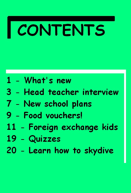
Preliminary Contents Page
I have created a contents page to fit into my college magazine. I have placed a clear heading at the top of its page with an edgy right angle border to convey a young take on things. The text is in black as it nicely stands out infront of the green background. I've chosen to use a bright green colour as I have the intention of grabbing attention. The details of what's inside of my magazine is simply dislayed with the page number and information. I purposely avoided using pictures to ensure all attention would be placed on the words.
No comments:
Post a Comment