Monday 8 November 2010


Front cover Analysis
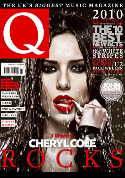
The music magazine Q usually focuses on rock artists, which creates some confusion as to why they have chosen to use former pop band member Cheryl Cole as their front cover model. Although Cheryl isn’t a rock artist, through mis-en-scen she has been made to effectively look like an arguably conventional rock musician.
With location, this picture is most likely to have been taken in a building with an endless amount of equipment, however the effect and setting the editor tried to project is one with Cheryl outside on a rainy night. Through pathetic fallacy the rain connotes a stormy, blustery and dark mood which is often associated with the genre of rock music. This is heightened with Cheryl’s dark leather looking jacket, cooperating with the use of heavy eye make-up which reiterates the gloomy and somewhat gothic element linked with rock music.
Cheryl’s bold red lip stick fits in with the house style of red black and white Q has developed through it’s decades of publishing. Cheryl’s mouth is also slightly open with her teeth showing and her tongue moved to the corner of her mouth. By bearing her teeth, I initially think it adds a sense of aggression however when looking at her tongue I believe it’s been done as a technique to sexualise Cheryl as many would find this seductive. Also her lips are painted red deliberately to draw attention, much like the logo Q, as against the black and brown colours it stands out effectively.
Additionally, Cheryl’s face is drained of any healthy colour, her cheeks are not red and there is no real glow about her face, this I believe was done intentionally to comply with the stereotypes of rock music being less feminine and instead gloomier, again working well with the connotations of rain. The lighting has been crafted to dispose of any shadows on Cheryl’s face which works well with the close up head shot, connoting revelation, implying the inside article will contain some sort of exposure.
Elsewhere, Cheryl’s direct mode of address is another technique used to conform to the conventions of a rock musician. The engaging eye contact together with her unyielding facial expression creates a resolute stare which has the effect of arguably instigating challenge. It projects a tough attitude which is very different for Cheryl who is probably used to softer and more flirtatious photo shoots rather than ones like these where she is made to emit power and authority.

Analysing a Contents Page

The contents page spreads over two pages. There’s a combination of text and pictures. The pictures illustrate the content and focus of the magazine.
There’s a black and white long shot of Cheryl Cole 
striking an abstract pose. This shows it’s expertly done which adds a sense of professionalism and stardom to the singer, representing her in a positive light. She is wearing a metallic studded tank top and ripped tights which convey the wild and bold lifestyle of a rock star; coinciding with the original rock/punk theme Q magazine is often associated with. This shot contrasts with the light, pop music Cole did with pop band Girls Aloud, however after her slighlty recent break from the band, Q has decided to shoot her with a more extreme, rocky look. The arrangement of the images is similar to a collage. Images are placed sporadically across the pages and some aren’t in line with the page. This adds a reckless idea corresponding to the lifestyle the artists written about in the magazine. Additionally in this instance, there are numerous pictures larger than the text and
This magazine uses a simple colour scheme consisting of red, white and black. Other colours used come from the pictures themselves. By keeping to this colour scheme the magazine gets consistency which leads to the magazine being recognisable just by a glance at the colour format. A house style is created as the repeated use of the same colour and font gives the magazine a distinctive identity.  
This contents page has two sources of indication; the text and the images. Both have numbers which point the audience to the page with its information. There are pictures with musicians which are likely to have a story on them. There are however other topical issues in the magazine but they don’t differ too much as it’s all showbiz related. This tells me the focal point of the magazine is the entertainment industry and the insertion of several quite professional pictures shows there should be a lot of information which is mostly accurate.
At the bottom of the contents page there is an imperative which says; “subscribe at www.greatmagazines.co.uk”. This is a promotion to accumulate followers and increase support.
The magazine logo is placed in the top left hand corner of the page. This is where natural reading begins. By placing the logo here it imprints the logo and the name in to the readers mind. The bold use of red also alerts readers and serves as an ‘attention grabber’. The connotation attached to the colour red works well with the themes of the magazine. The themes being quite extreme and aggressive to represent the individuals featured in the magazine.
Q has several franchises. Along with a monthly magazine, they have music channel aired on television, a radio station call “Q player”. They’re not promoted on the contents page.

Q Article Analysis


This article focuses on Girls Aloud band member Cheryl Cole who recently took a break from the highly successful pop band. Her solo career has her singing a different style of music which has still has elements of pop but has considerably moved toward R 'n' B. Initially writing a feature article on Cheryl Cole in Q seemed like an odd choice as the magazine tends to report on artists of the rock genre like Green Day or Muse. However, the women Q do choose to feature are usually sexualised and as Cheryl was once voted the world's sexiest woman at one point, it explains why they picked her. Having an article on Cheryl suggests the targeted audience will be people with an interest in current musical affairs as she is a very modern musician, covering a contemporary genre of music. Also, being the sex symbol she is, she could also draw in a male audience.


This article uses a mix of both complex and simple sentences with several poly-syllabic words which denote it is formally written. By avoiding continuously using short playful sentences the article moves away from being light hearted. Words like ‘Consequently’ and ‘beguiling’ are used instead of a simpler lexis which suggest the article, and magazine are aimed at an intellectual and older audience. This idea is reiterated as three quarters of the page is consumed with words alone and not pictures.


The article is opinionated, clearly displaying its attitude...


There are several quotes from Cheryl and other artists which add accuracy and credibility to the magazine which projects professionalism. It also does the job of satisfying the readership who will have a keen interest in the musician and will want to hear as much from her as possible...


Cheryl is portrayed positively through the pictures as it shows her to look very attractive. As they are professionally taken as opposed to ones obtained by the paparazzi, it shows the magazine supports this artist, they don’t criticise her and instead have featured her to raise her current profile with their publicity...


The red white and black colour scheme is continued, in keeping with the house style of Q. This creates the effect of conveying maturity which directly appeals to Q’s target audience...


This article doesn’t totally demand prior knowledge for comprehension as some background details are included such as “ “ ... however this isn’t done repetitively which is done purposely to respect the intelligence of its targeted educated readers...