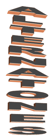
The immediate denotations I gather from the colour red against the tones of black and white are alertness. I believe the desired effect of using red for the colouring of the letters is to grab attention as red carries the connotation of importance or urgency. The bold lettering adds to conveying the theme of importance as the thickness makes the title block stand out. The mono-syllabic lexis choice also makes it easy to read which an effective technique as consumers will base whether they pick the magazine up on their first glance. The title itself ‘vibe’ is a word frequently associated with music, especially in R&B/Hip hop. It’s also quite a young colloquial term which explains why their target audience is 12 – 24 year olds.
This title block reflects its content and target audience effectively through its appearance. The slashed, damaged and cracked look implemented on the lettering connotes and emulates the life style of a stereotypical rock artist or band, the stereotype being smashing hotel rooms and engaging in violence. ‘Kerrang! is the onomatopoeic sound of the strumming of a guitar which again complies with the rock content of the magazine. The chosen colouring of black and white is used to reflect a gothic, dark side often affiliated with rock music. The capital letters and the exclamation mark at the end of the title once again supporting the idea of the loudness associated with rock music.

Phonetically ‘Q’ is ‘cue’, this was done intentionally and in fact was the original title of the magazine. It was called this to as it has the musical connotation as it’s a direct reference to the very common phrase used to introduce acts. In this instance, I think the colour red connotes danger and rage, successfully keeping in with the rock genre Q is about. As ‘Q’ is just one letter it has easily become iconic through its simplicity and the red and white house style. Additionally red and white are also the colours of the English flag which may have been chosen to serve the double purpose of expressing nationalism.

This title block possesses a very bold and rigid font which connotes strength and power. The use of straight lettering visually almost replicates a fortress or something metallic like a shield. The effect of this is it connotes themes arguably associated with the genre of indie music. The themes being rebellion or some sort of enclosure. When said aloud ‘NME’ is pronounced enemy which again ties in with fortress type appearance shown when looking at the title block, the rebellious phonetics could be the reason why the magazine is targeted at a slightly younger audience; 15 – 24 year olds as teenagers are known for going through a rebellious stage when growing up.