Monday, 13 December 2010


Ideal Consumer

My magazine is targeted at a young audience; 15 – 24 year olds to be exact. I’m looking to attract girls primarily but I don’t want to exclude males entirely. The content of my magazine will cover the genres of alternative rock and soul music, hoping to intrigue somebody with an interest in artists like Florence + the Machine and Biffy Clyro. Ideally, my readership will have at least a college/sixth form education as the lexical choice in my magazine will have some verbose language and only consist of Standard English. Words will outweigh pictures in my magazine. Additionally prior knowledge will be useful as I will most report on current news concerning the artist featured without always providing a back story. From the feedback I received from my questionnaire, the price of my magazine is not going to be too expensive so my target consumer will not need to have wealthy parents or a 6 figure salary to afford an issue every two weeks.

Analysis of Results


1. These results show 61% of my target readership would like to pay between £1 and £1.50 for my magazine. To comply with this I will place a puff in the top corner of the cover page with the price £1.50.


2. These results show 61% of my readership want an equal mix of both up and coming and established, mainstream artists. To please them im going to make my featured musician someone who is new to the industry but has already gotten 2 number ones.


3. These results show 57% of my readership would like the magazine to contain an equal mix of information on both bands and individual artists. My feature article will be on an individual musician, however to satisfy the majority of the recipients in my contents page I will write that there are articles and pictures on and about bands.   


4. Although the majority say they want a light hearted magazine I'm going to ignore them and make my article serious because I want to attract an audience that doesn’t currently have a music magazine that directly appeals to them – intelligent young females.


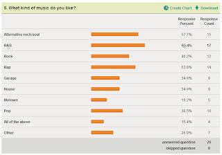
5. Although the majority want my magazine to be RnB I'm going to centre the genre around alternative rock/soul music for the same reasons stated above.


6. 75% say they are more interested in artists from Britain so using this information, I'm going to make my cover artist of English heritage. 


7. 75% of my readership find freebies the most appealing so on my magazine im going to offer a free CD of, the front cover artist's acoustic songs.

8. The results show exclusive interviews and pictures are what they want to see the most, so in my contents page I will leave information about articles printed in the magazine on other musicians. I'm going to keep to my original idea of writing an article as I want my magazine to be sophisticated, I will place as many pictures on my double page article as possible without taking attention off the words.

Magazine Proposal and Questionnaire

My chosen genre for my magazine is music, focusing on alternative, soul and rock artists like Florence + the machine and Paramore. I have decided to incorporate musicians from in and outside Britain to attract a wider audience. My main reason for this is America arguably dominates the music industry so leaving them out would depreciate the content of my magazine. It will aim to target an audience of intelligent females aged 16 – 24 as the lexis I’m going to use will be quite sophisticated rather than glamorous. I’ve chosen to do this because the music magazines currently out are designed to attract a female audience and are mostly ‘glitzy’ gossip magazines like Top of the Pops who just feature pictures of idolised pop stars like Justin Beiber to hook consumers.
1.       If this music magazine was released fortnightly, how much would you deem a reasonable price?
£1 - £1.50 [  ] £1.50 - £2 [  ] £2.50 - £3 [  ] £3.50 + [  ]

2.       Would you like to read about up and coming artists?
Yes – More than mainstream artists [  ] No – I’m not interested [  ] Both [  ]

3.       Are you more interested in bands or individual artists?
Bands [  ]  Individual artists [  ]  Both [  ]

4.       Do you prefer a light hearted magazine or a more serious one?
Light hearted [  ]  A serious one [  ]

5.       What kind of music do you like? (You may choose more than one)
R&B [  ]                                   Garage [  ]                All of the above [ ]
Rock [  ]                                  House [  ]                  Other [  ]
Alternative rock/soul [  ]     Motown [  ]
Rap [  ]                                    Pop [  ]      

6.       Would you like it to focus on Britain’s artists or would you like it to include international musicians?
Yes [  ] No [  ]

7.       Which of the following do you find the most appealing?
Freebies [  ]  Competitions [  ]  Special price offer [  ]

8.       In a music magazine, which do you find the most interesting? You may choose more than one.

Gig reviews [  ] In depth articles [  ] Pictures [  ] Exclusive interviews [  ]


I used an online information gathering website called Survey Monkey to gage the interest of a sample of the public. Here's the link:

Monday, 8 November 2010


Front cover Analysis
The music magazine Q usually focuses on rock artists, which creates some confusion as to why they have chosen to use former pop band member Cheryl Cole as their front cover model. Although Cheryl isn’t a rock artist, through mis-en-scen she has been made to effectively look like an arguably conventional rock musician.
With location, this picture is most likely to have been taken in a building with an endless amount of equipment, however the effect and setting the editor tried to project is one with Cheryl outside on a rainy night. Through pathetic fallacy the rain connotes a stormy, blustery and dark mood which is often associated with the genre of rock music. This is heightened with Cheryl’s dark leather looking jacket, cooperating with the use of heavy eye make-up which reiterates the gloomy and somewhat gothic element linked with rock music.
Cheryl’s bold red lip stick fits in with the house style of red black and white Q has developed through it’s decades of publishing. Cheryl’s mouth is also slightly open with her teeth showing and her tongue moved to the corner of her mouth. By bearing her teeth, I initially think it adds a sense of aggression however when looking at her tongue I believe it’s been done as a technique to sexualise Cheryl as many would find this seductive. Also her lips are painted red deliberately to draw attention, much like the logo Q, as against the black and brown colours it stands out effectively.
Additionally, Cheryl’s face is drained of any healthy colour, her cheeks are not red and there is no real glow about her face, this I believe was done intentionally to comply with the stereotypes of rock music being less feminine and instead gloomier, again working well with the connotations of rain. The lighting has been crafted to dispose of any shadows on Cheryl’s face which works well with the close up head shot, connoting revelation, implying the inside article will contain some sort of exposure.
Elsewhere, Cheryl’s direct mode of address is another technique used to conform to the conventions of a rock musician. The engaging eye contact together with her unyielding facial expression creates a resolute stare which has the effect of arguably instigating challenge. It projects a tough attitude which is very different for Cheryl who is probably used to softer and more flirtatious photo shoots rather than ones like these where she is made to emit power and authority.

Analysing a Contents Page

The contents page spreads over two pages. There’s a combination of text and pictures. The pictures illustrate the content and focus of the magazine.
There’s a black and white long shot of Cheryl Cole 
striking an abstract pose. This shows it’s expertly done which adds a sense of professionalism and stardom to the singer, representing her in a positive light. She is wearing a metallic studded tank top and ripped tights which convey the wild and bold lifestyle of a rock star; coinciding with the original rock/punk theme Q magazine is often associated with. This shot contrasts with the light, pop music Cole did with pop band Girls Aloud, however after her slighlty recent break from the band, Q has decided to shoot her with a more extreme, rocky look. The arrangement of the images is similar to a collage. Images are placed sporadically across the pages and some aren’t in line with the page. This adds a reckless idea corresponding to the lifestyle the artists written about in the magazine. Additionally in this instance, there are numerous pictures larger than the text and
This magazine uses a simple colour scheme consisting of red, white and black. Other colours used come from the pictures themselves. By keeping to this colour scheme the magazine gets consistency which leads to the magazine being recognisable just by a glance at the colour format. A house style is created as the repeated use of the same colour and font gives the magazine a distinctive identity.  
This contents page has two sources of indication; the text and the images. Both have numbers which point the audience to the page with its information. There are pictures with musicians which are likely to have a story on them. There are however other topical issues in the magazine but they don’t differ too much as it’s all showbiz related. This tells me the focal point of the magazine is the entertainment industry and the insertion of several quite professional pictures shows there should be a lot of information which is mostly accurate.
At the bottom of the contents page there is an imperative which says; “subscribe at www.greatmagazines.co.uk”. This is a promotion to accumulate followers and increase support.
The magazine logo is placed in the top left hand corner of the page. This is where natural reading begins. By placing the logo here it imprints the logo and the name in to the readers mind. The bold use of red also alerts readers and serves as an ‘attention grabber’. The connotation attached to the colour red works well with the themes of the magazine. The themes being quite extreme and aggressive to represent the individuals featured in the magazine.
Q has several franchises. Along with a monthly magazine, they have music channel aired on television, a radio station call “Q player”. They’re not promoted on the contents page.

Q Article Analysis


This article focuses on Girls Aloud band member Cheryl Cole who recently took a break from the highly successful pop band. Her solo career has her singing a different style of music which has still has elements of pop but has considerably moved toward R 'n' B. Initially writing a feature article on Cheryl Cole in Q seemed like an odd choice as the magazine tends to report on artists of the rock genre like Green Day or Muse. However, the women Q do choose to feature are usually sexualised and as Cheryl was once voted the world's sexiest woman at one point, it explains why they picked her. Having an article on Cheryl suggests the targeted audience will be people with an interest in current musical affairs as she is a very modern musician, covering a contemporary genre of music. Also, being the sex symbol she is, she could also draw in a male audience.


This article uses a mix of both complex and simple sentences with several poly-syllabic words which denote it is formally written. By avoiding continuously using short playful sentences the article moves away from being light hearted. Words like ‘Consequently’ and ‘beguiling’ are used instead of a simpler lexis which suggest the article, and magazine are aimed at an intellectual and older audience. This idea is reiterated as three quarters of the page is consumed with words alone and not pictures.


The article is opinionated, clearly displaying its attitude...


There are several quotes from Cheryl and other artists which add accuracy and credibility to the magazine which projects professionalism. It also does the job of satisfying the readership who will have a keen interest in the musician and will want to hear as much from her as possible...


Cheryl is portrayed positively through the pictures as it shows her to look very attractive. As they are professionally taken as opposed to ones obtained by the paparazzi, it shows the magazine supports this artist, they don’t criticise her and instead have featured her to raise her current profile with their publicity...


The red white and black colour scheme is continued, in keeping with the house style of Q. This creates the effect of conveying maturity which directly appeals to Q’s target audience...


This article doesn’t totally demand prior knowledge for comprehension as some background details are included such as “ “ ... however this isn’t done repetitively which is done purposely to respect the intelligence of its targeted educated readers...

Sunday, 31 October 2010

My article

"It's not my fault he left, he can find someone else to blame"
Singer/songwriter Kara Payne, 23, is one band member down after an altercation leads to ex-drummer Danny Cooper leaving Waterproof Robot.
Signs of the unexpected news were first seen at the recent concert at the O2 where a last minute change was made; scrapping the band's hit 'Underwater' which featured a drum soloLater the same evening, Cooper was nowhere to be seen at the V.I.P party and it's suspected he went home on his own following the harsh decision. When Alternatones  asked Kara her thoughts on the matter she told us "He said my attitude was 'unwelcoming', he's just being a spoilt little baby as far as I'm concerned...it's not my fault he left, he can find someone else to blame". Hot head Kara is adamant Cooper isn't crucial to the running of the band, there are even rumours of a new talent show, run by Waterproof Robot, in search of a replacement drummer. 

This isn't the first time the band have threatened to part ways as in June last year arguments in between Jo Strauss, lead guitarist and vocals, and repeat offender Kara Payne resulted in a solid 2 month musical hiatus with cancelations to TV and radio interviews and CD signings. Whether this latest squabble is going to cause the same hassle to loyal fans is unknown but according to their manager Tim Wallis it's "Just a phase that he's very confident they will all overcome together". With a European tour just a few months away it’s in their best interest they do. After a disappointing outcome at last week’s MOBO awards, with no trophies for the mantel piece, Waterproof Robot have a lot of work to do if they’re going to want to stay current in the music industry and they’re not going to do that if they can’t even sustain their all too patient fan base.


Monday, 18 October 2010

Kerrang! Cover Analysis in progress


Kerrang! is a very rock and metal based music magazine which explains their choice of featuring Biffy Clyro as their cover models.
The title of the music magazine is positioned at the top of the page which follows the conventions of print magazines, this is done in the hope it is the first thing consumers will see.
The main singer is placed in the centre and in the foreground with the bassist and guitarist just behind him. A mid shot has as it’s a convenient camera shot to make the three look as equal as possible even though one band member is placed in front. They all have a direct mode of address with fixed and firm facial expressions which accurately conveys their genre of rock music.
The main singer is wearing a white hooded jumper, which against his dark hair complies with Kerrang!’s house style. The connotations often attached to the tones black and white are darkness and eeriness, matching the connotations attached to rock and metal music. To add, the lighting has deliberately been crafted to create shadows in the middle of Simon Neil’s face which reiterates the shady element.
Simon Neil’s body language has his hand on his chin showing a contemplative pose. This illustrates a more intellectual side to the rock band which moves away from the stereotype of rock musicians just making nonsensical noise. A possible reason for this is because Kerrang! usually writes more academic articles.
Just below Simon is anchorage text which reads the name of their band “Biffy Clyro”. It is bold and big, serving as a caption revealing the act it rests upon. The lettering is around about as big as the magazine title and visually sandwiches the band in between the two texts.  Simon is placed in front of the magazine title but not the band title, this creates the effect of emphasising how engaging the shot is, as if he’s coming out the magazine.
Elsewhere, the magazine includes offers of free posters, a technique to directly attract readership. This is another convention of music magazines, offers of relevant items readers can keep which serve the purpose of not only drawing in an audience but also if purchased, it will remind consumers of a perk they gained from the magazine, increasing loyalty.
A third convention this magazine follows are the use of puffs. Puffs....

Mojo contents page analysis, in progress


At the top of the page we see the magazine title Mojo, the title block also serves as the magazine’s logo so with that said placing Mojo on the contents page follows the conventions of music magazines. 
This contents page is on one page and consists of one background black and white photograph of soul singer Corinne Bailey Rae. Using black and white promotes maturity as it bears the connotations of sophistication and class. These are themes Mojo is known for as it targets an older audience of 24 – 44 year olds. The singer also has a direct mode of address, head is down which denotes vulnerability however the eye contact indicates confidence. The location of the photograph is in a grassy park with trees and fallen leaves, the setting projects tranquillity, another mature ideology likely to interest an older audience. Corinne isn’t sexualised in the slightest, wearing clothes which aren’t revealing which reiterates the efforts made by the magazine to cater to its older audience.
There’s columned writing which is tailored around the singer, not crossing her face once. The text is in black with select parts in red to attract attention. Another technique to draw interest is making some of the text bigger, in extra bold and in red. The use of solely one picture is another method of conveying maturity as rather than placing several sporadic pictures across the page which ambushes the readership; this one picture does the opposite projecting calmness which again is something which appeals to an older audience.
There aren’t any promotional features on this contents page. However Mojo do have a website with multiple features which include links to the social networking sites facebook and twitter. Additionally, the readership are able to subscribe to the music magazine to hear exclusive news before anyone else and for chances to enter competitions.

Kerrang! Magazine Article Analysis


Analysing magazine articles


The article focuses on the bassist of Fallout Boy Pete Wentz. They cover the musical genres of alternative rock, punk and pop. As the article is centred on him, the target audience will be fans of his music and people with an interest in rock, pop and punk.


The lexical choice in the article is quite verbose which implies the articles and magazine is directed at an educated, well-read audience. Words like “laceration” and “divulge” indicate the article is a more serious one, aimed at an older audience. The quote from the bassist on the other hand uses a colloquial lexis; he says he was “bummed out”. The word choice would be familiar with readers, as it would be commonly used among them.

The writer of the article sets a knowledgeable narrative tone. It’s very detailed as it’s filled with facts about the bassist; “Patrick Stump started work on his debut album… Following an altercation in a New York City night club… Pete started writing songs for a new project…”. The quality of the writing is very professional, using formal language and Standard English. It uses paragraphing well to add professionalism.

The layout of the article is columned, replicating a newspaper, which reiterates the seriousness and sophisticated nature of it. Throughout the magazine the same font is used which creates consistency. Above the article, on the same page, a quote has been depicted and used a title to point out what the item is going to be about. The first two words of the article are in the same colour as the title and it is bigger and in capitals. This is done to grab attention and to influence buyers to read it.

The whole page is entirely made up of text. As it is columned it implies readers will be familiar with the layout from reading broadsheet newspapers. It also suggests their readers will be more educated as it follows a mature format, integrating quotes from a previous interview rather than a simpler ‘interviewer –interviewee ‘arrangement.

The image of the bassist is a positive one. It is done professionally rather than one taken by the paparazzi. This projects an optimistic view of the rock star which contrasts with the title of the article saying, “I was at rock bottom”. It shows the writer is on the Wentz’s side.
There’s a sub-heading summarising the focus of the article and it’s saying there is an insight into the bassist life straight from the man himself.

The article itself is very detailed, providing facts upon facts about the bassist. Prior knowledge about Pete Wentz would be beneficial to the reader however it isn’t a necessity for understanding and enjoying the article. It gives names: “Craig Owens”. It gives events: “...altercation at a New York City night club”, it gives places: “...a family holiday in Jamaica” etc.

An overall evaluation of this article shows the magazine stays true to its initial target audience, featuring an article on alternative rock bassist Pete Wentz in a positive light. It radiates a classy, intellectual commentary keeping the sophisticated tone of the magazine.


Sunday, 17 October 2010

Image 3


This is a mid-long shot of Britney Spears.
She appears to be lying on a satin/silk bed sheet. It's pink however quite a dark pink to show there are elements of 'girliness' however that she's is also slowly moving away from that to become a more mature sex symbol. The costume of Spears adds to the sexualisation of the image. She's wearing a black bra, briefs and a flimsy half sleeved top. Her torso and cleavage is fully exposed
She has a direct mode of address which serves the purpose of engaging with the audience. Her mouth is slightly open which leaves her with a suggestive facial expression which is reinforced with her costume conveying a very sexual image.
The props used include two controversial items. One is a stuffed toy which implicates an innocent, naiive image as it represents a typical childhood possession. The phone she holds in the other hand in a way signifys the transition from the childish toy to a more mature young woman. It has the effect of suggesting late night phonecalls as she is in her pyjamas and on her bed, again projecting a seductive vibe.

Image 2

The front cover has an extreme close up of Britney Spears' face.

She has a defeated and quite lifeless expression on her face. The shot is in black and white, the effect of which is it emphasises the dull and despondent sentiment. Because the shot is an ECU it also serves the purpose of implying that within the magazine there will be a detailed and meticulous look or article about the pop star. There is again a direct mode of address which creates the feeling she is looking potential readers in the eyes, something which is essential for truth telling. The eye contact from Britney gives the impression she herself is telling her story and that it is 100% truthful.

Image 1

This is a Rolling Stones magazine with pop star Britney Spears on the front cover. 

Britney is placed in the centre of the cover using a mid-shot; showing her head down to her bum.The mis-en-scene of the picture reveals a lot of Britney's body as she is only wearing white pants. This immediately gives the magazine quite adult themes which indicates it's directed at an older audience. To add, her body language is seductive as she is pushing out her bum attract attention the curves. The prop used seems to be a T-shirt Britney removed leaving her breasts nude. This is done to repeat the seductive portrayal of the pop star.
She has a direct mode of address which is done purposely to engage people looking at the cover. She's also smiling which adds to the inviting nature of the front cover.
The clothing Britney is wearing is white; coinciding with the colour scheme of the front cover. The title is in purple, a young, playful tone which works well with the cover model as it moves away from a serious feel which, known to all, is far from what Britney is at this stage in her career.


Saturday, 16 October 2010

Preliminary Contents Page

I have created a contents page to fit into my college magazine. I have placed a clear heading at the top of its page with an edgy right angle border to convey a young take on things. The text is in black as it nicely stands out infront of the green background. I've chosen to use a bright green colour as I have the intention of grabbing attention. The details of what's inside of my magazine is simply dislayed with the page number and information. I purposely avoided using pictures to ensure all attention would be placed on the words.

Unedited image

Wednesday, 6 October 2010


Preliminary Task


I have designed the front cover of a college magazine entitled "Bishop News". My magazine is aimed to target the students of Bishop Challoner sixth form. My model is a male student from the sixth form which I'd hoped would project familiarity among potential readers. I also used puffs placed along the left hand side. I positioned it there so it looked natural, for conventional reading. I made the text black as it is over my models white clothing, I thought black would be the most suitable colour for standing out and keeping in with the simple layout.
After taking the picture I put it onto paint where I added the text using the text tool. I got the barcode image from google and pasted it there.